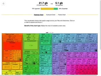
I recently built a small tool to help understand what's taking up space in my development directories.
What makes this tool different? It lets you toggle between showing only tracked files, only ignored files, or everything - which turned out to be surprisingly useful!
Here's what I learned about disk usage tools, visualization techniques, and surprisingly, about the stuff that accumulates in developer directories.
Table of Contents
- Why Build Another Disk Usage Tool?
- Features & Screenshots
- Technical Implementation
- Design Decisions & Trade-offs
- Performance Characteristics
- Prior Art & Alternatives
Why Build Another Disk Usage Tool?
My ~/src directory was using 300GB. That seemed like way too much - I had about 500 repos:
- ~300 projects where I was patching dependencies or contributing upstream
- ~200 of my own projects
Using du | sort helped me clean it down to 75GB, but I kept thinking "there must be a better way to see this data." Specifically, I wanted to:
- Understand how much space was actual source code vs build artifacts
- Find where the largest files were hiding
- Identify which projects I could safely delete
- The way I think, I simply wanted to see it visually
Features & Screenshots
This is a CLI program first. I added a du output mode that exactly replicates what du does, so you can drop in replace it in scripts or with other tools. It also helped me with testing.
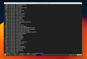
But the real magic is in the visualizations.
Clicking the storage distribution bar (75% Ignored/24% Essential) toggles to a two-tone view where yellow blocks represent files matched by .gitignore rules and green blocks show tracked files.
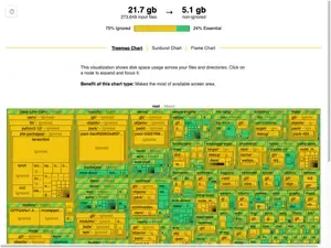
This makes it really clear that while we have 21.7 GB total, 16.6 GB is stuff we could probably clean up. It's easier to spot cleanup opportunities in this view because we can get a sense of whats inside ignored directories in a single glance.
Sunburst & Flamegraph views
The sunburst chart is my favorite way to look at disk usage data. What makes it great is how it combines visual and text information: sunburst's radial layout lets you see the hierarchy clearly, while a sorted list of your biggest files and directories. When you hover over an item in the list, it highlights that segment in the sunburst chart, showing you exactly how much space it takes up relative to everything else. It works the other way too - hover over any segment in the sunburst, and you'll see where it ranks in the list.

Here is the sunburst chart toggled into two-tone view.
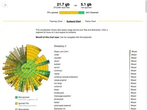
Honestly, I don't use the flamegraph - it's missing some key features like being able to double click to zoom into nodes.
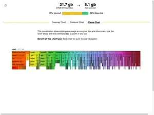
One limitation worth noting: when you switch between views, they don't stay in sync. So if you zoom into a directory in the sunburst view and then switch to treemap, you'll have to find that directory again. Something to improve in the future!
Technical Implementation
The core innovation in this tool is its handling of ignored files. Here's how ripgrep does it: when it walks directories, it has this super fast iterator that just... skips anything that's ignored! This makes a ton of sense for ripgrep - why would you want to look at files you're ignoring?
BUT! For my use case, I actually wanted to see everything AND know whether it was ignored. So I went in and hacked on their iterator to behave quite differently with a suprisingly small change. The cool thing about this change is that it keeps all the original behavior but adds some super useful new capabilities. Here's what I did:
Instead of completely changing how the iterator works, I added a configuration flag that lets you choose:
- Classic mode: Skip ignored files (just like ripgrep!)
- Reverse mode: Skip non-ignored files (new!)
- See-everything mode: Visit absolutely everything (also new!)
The main change was adding a boolean field to every item the iterator yields, so you always know whether something was ignored or not. This means there's a small memory overhead - we're carrying around that extra metadata - but we get to keep all of ripgrep's original performance optimizations when we want them!
In reverse and see-everything mode it's necessarily going to be slower when there are lots of ignored directories since it has to look inside all of them. Unluckily for us in reverse mode we still have to visit every single non-ignored file and directory too. The only time you get a structural speedup over du is when you want to only look at non-ignored files. Only then we can skip all the ignored directories.
The patch itself is small (about 50 lines: https://github.com/PeoplesGrocers/disk-usage-cli/tree/main/crates/patched_ignore), but it fundamentally changes how the ignore handling works. Since the performance and use cases are so different, I'm not sure if it makes sense as an upstream contribution.
Specifically
- https://github.com/PeoplesGrocers/disk-usage-cli/blob/b2aeb8dd1b01e330c3c6f22e309c1ec50ea25f13/crates/patched_ignore/src/walk.rs#L30-L35
- https://github.com/PeoplesGrocers/disk-usage-cli/blob/b2aeb8dd1b01e330c3c6f22e309c1ec50ea25f13/crates/patched_ignore/src/walk.rs#L1016-L1060
💡 Working on something similar? I'd love to hear about your approach! Drop me an email.
Current Limitations & Future Improvements
-
Single-threaded Directory Traversal: While the ignore-handling code is optimized, the actual directory walking is currently single-threaded. Adding parallel traversal (like dua-cli does) would significantly improve performance. The crate I modified contains a parallel iterator and it should be straightforward to add this feature. I simply chose not to spend the time.
-
No Filesystem Cache: Each scan requires reading the entire directory tree. Adding a cache and filesystem watcher would allow:
- Instant updates after file deletions
- Real-time visualization of space changes
- Elimination of the ~30 second scan time on larger directories
Design Decisions
-
Embedded Web App: Rather than requiring users to install a separate GUI application, embed a small web visualization directly in the binary. This provides a seamless experience while keeping the tool self-contained. Think
go tool pprof -http=:8080 -
Multiple Visualization Types: Each visualization type (treemap, starburst, flamegraph) offers different insights:
- Treemap: I like seeing how unexpectedly large files "pop" out.
- Starburst: I like to see the names of tiny files and directories too. I'll use it to clean up tiny hidden files.
- Flamegraph: Ctrl+Scroll to zoom is way easier to implement for 1D than for 2D treemap.
-
Standard Library HTTP Server: Using std::net keeps our dependencies minimal.
Implementation Choices
Web Visualization
I built the visualization component by modifying the esbuild bundle visualizer. A few things made this an obvious choice:
- I had just used it the previous week and noticed how clean the implementation was
- The entire webapp would only add about 40KB when embedded in the CLI
- It already implemented the key feature I needed - toggling between two categories of files
- Evan Wallace's code is notably concise and efficient
I suspected I could adapt it for visualizing ignored vs non-ignored file structures with minimal changes to the core visualization logic.
The main tradeoffs were:
- Pro: Very small payload size
- Pro: Could reuse existing, well-tested visualization code
- Pro: Already handled the exact category-switching interaction I wanted
- Con: Had to embed a webapp in a CLI tool (but the size made this acceptable)
Binary Size Impact
The tool starts at 1.7MB stripped (2.0MB unstripped), so I tracked size impact carefully but wasn't obsessive about it. Here's what each feature added:
| Change | Size | Delta | Stripped |
|---|---|---|---|
| Baseline: Core functionality | 2,074,136 | - | 1,761,136 |
| Add serde_json (export disk usage as esbuild metafile) | 2,110,600 | 36,464 | 1,794,240 |
| Simple HTTP server (std::net) | 2,127,512 | 16,912 | 1,811,312 |
| Browser auto-open functionality (UX improvement) | 2,169,544 | 42,032 | 1,846,032 |
| Embedded web app | 2,208,786 | 39,242 | 1,883,706 |
| Add tracing viz to web app | 2,220,696 | 11,910 | 1,895,616 |
| Final | 2.2MB | 1.8M |
Adding JSON export with serde_json was the first big jump. The basic HTTP server (using std::net) was surprisingly cheap.
The browser auto-open feature saves me ~2 seconds per run - I measured this by logging duration between when the URL was printed to stdout and when the webapp made its first API request. Seeing the results 2 seconds faster was worth extra 42KB to me. If your terminal makes links clickable then obviously the tradeoff is worse.
Even with terminals that support clickable URLs, auto-open still improves UX. Since the disk usage scan can take >10 seconds, I typically start the command and switch focus elsewhere. It's like cargo doc --open - you want the browser tab to just appear when the work is done, catching my eye on my second monitor. Without auto-open, there's still reaction time and context switching overhead that adds 500ms+ delays, even with clickable links.
There's clearly room to optimize - starting at 1.7MB for core functionality suggests we could probably slim things down quite a bit. But with each feature less than 42KB each, I focused on shipping useful functionality first.
Performance Characteristics
Measured on a Apple M2 Pro - 32GB - 2023
Small Directory Tree (55,717 files, depth 6)
| Operation | Duration |
|---|---|
| File reading | 23ms |
| JSON Parsing | 65ms |
| analyze Treemap | 143ms |
| analyze Sunburst | 173ms |
| analyze Flame | 164ms |
Large Directory Tree (1.7M files, 589MB, depth 10)
| Operation | Duration |
|---|---|
| File reading | 860ms |
| JSON Parsing | 3,195ms |
| analyze Treemap | 8,664ms |
| analyze Sunburst | 12,017ms |
| analyze Flame | 8,476ms |
Note: Color mapping updates take ~1.8-2.2 seconds for the 1.7M entry case.
Prior Art
Note: For a comprehensive comparison of existing tools, see our detailed comparison page
The disk usage visualization space has evolved through several generations:
- Early tools like
dufocused purely on data ncduadded interactivity and basic visualization- Modern Rust tools (dua-cli, dust, etc.) push performance and visual design
- GUI tools like WinDirStat and GrandPerspective offer platform-specific polish
Each tool has found its niche, but none specifically addressed the git-aware visualization need that motivated this project.
Looking to Collaborate?
I'm always interested in discussing new project ideas, especially in video tools, search systems, or user experience improvements. Email me at: karl@peoplesgrocers.com
You Might Also Like
Interested in my recent work? Check out Video Clip Library - a desktop app that brings modern search capabilities to offline video collections. It's a different domain, but the same focus on performance and user experience.
